Politics & public opinion
Follow changing answers, compare question wording, and uncover differences that a national average hides.
US adults · Nationscape weekly survey, 2019–2021
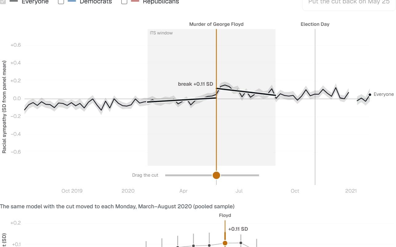
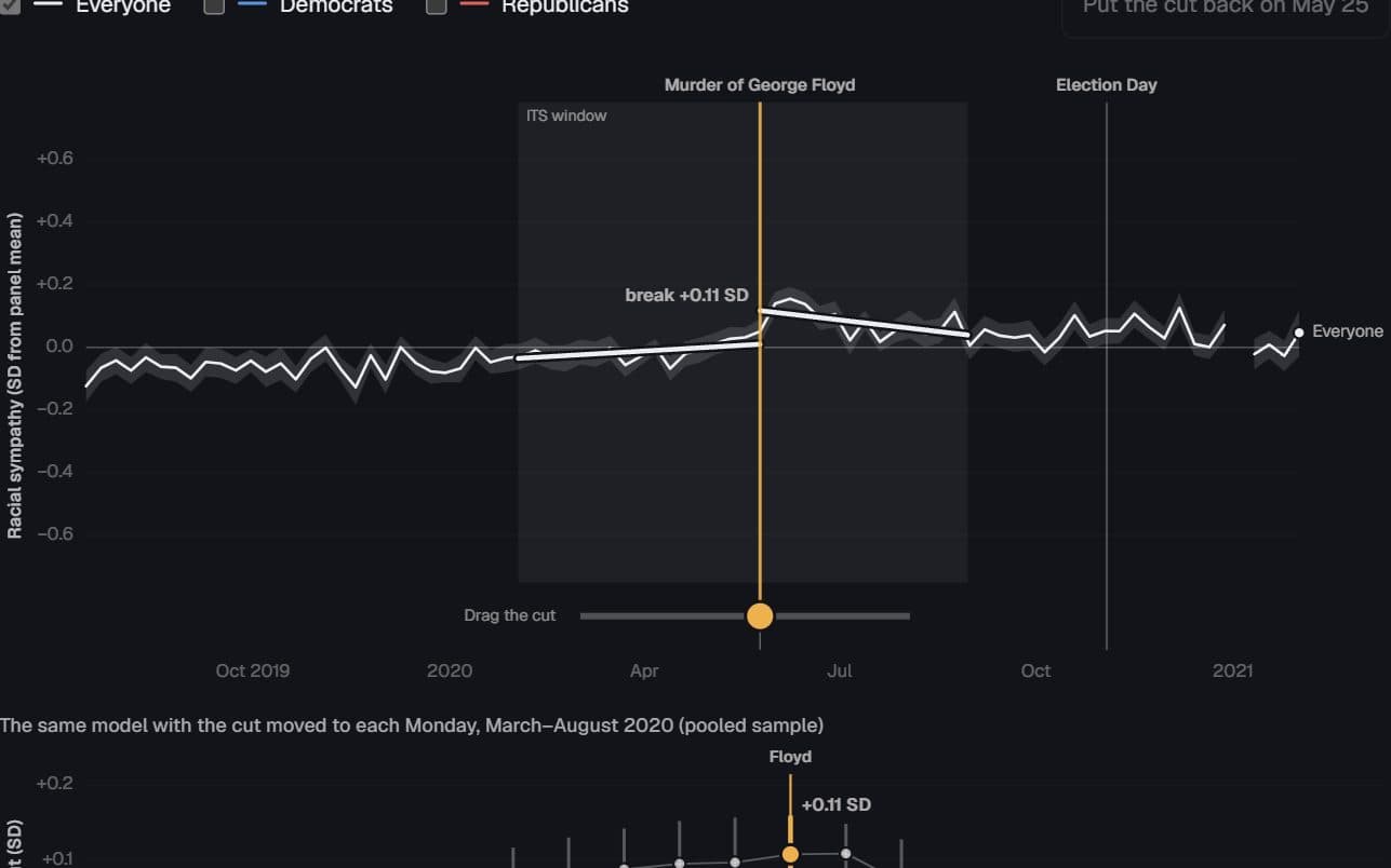
Sympathy broke the week of the murder
Did racial sympathy really jump when George Floyd was killed, or would a break appear wherever the cut was placed?
Hides: What caused the break. The model dates it to the week but cannot separate the video, the protests and elite cues.
Try it: Drag the cut to any week
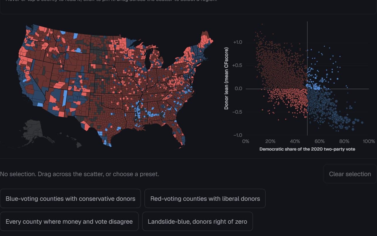
2,839 US counties · Stanford DIME donors and 2020 presidential returns
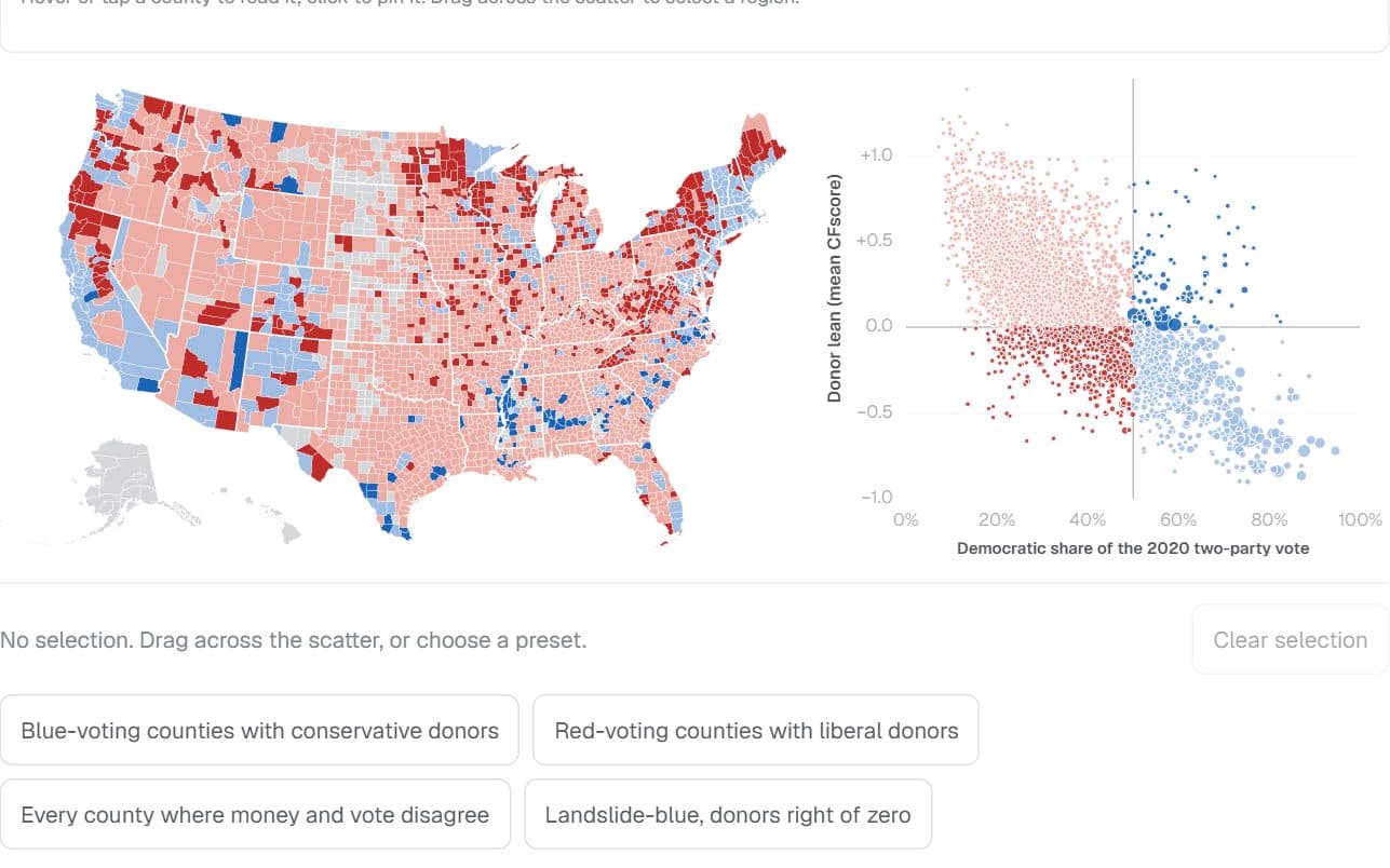
Where the money and the vote disagree
Which counties vote one way while their reliable donors lean the other — and who lives there?
Hides: Individuals. A county’s donor average says nothing about any one resident, and the national donor pool leans left.
Try it: Select counties on the scatter
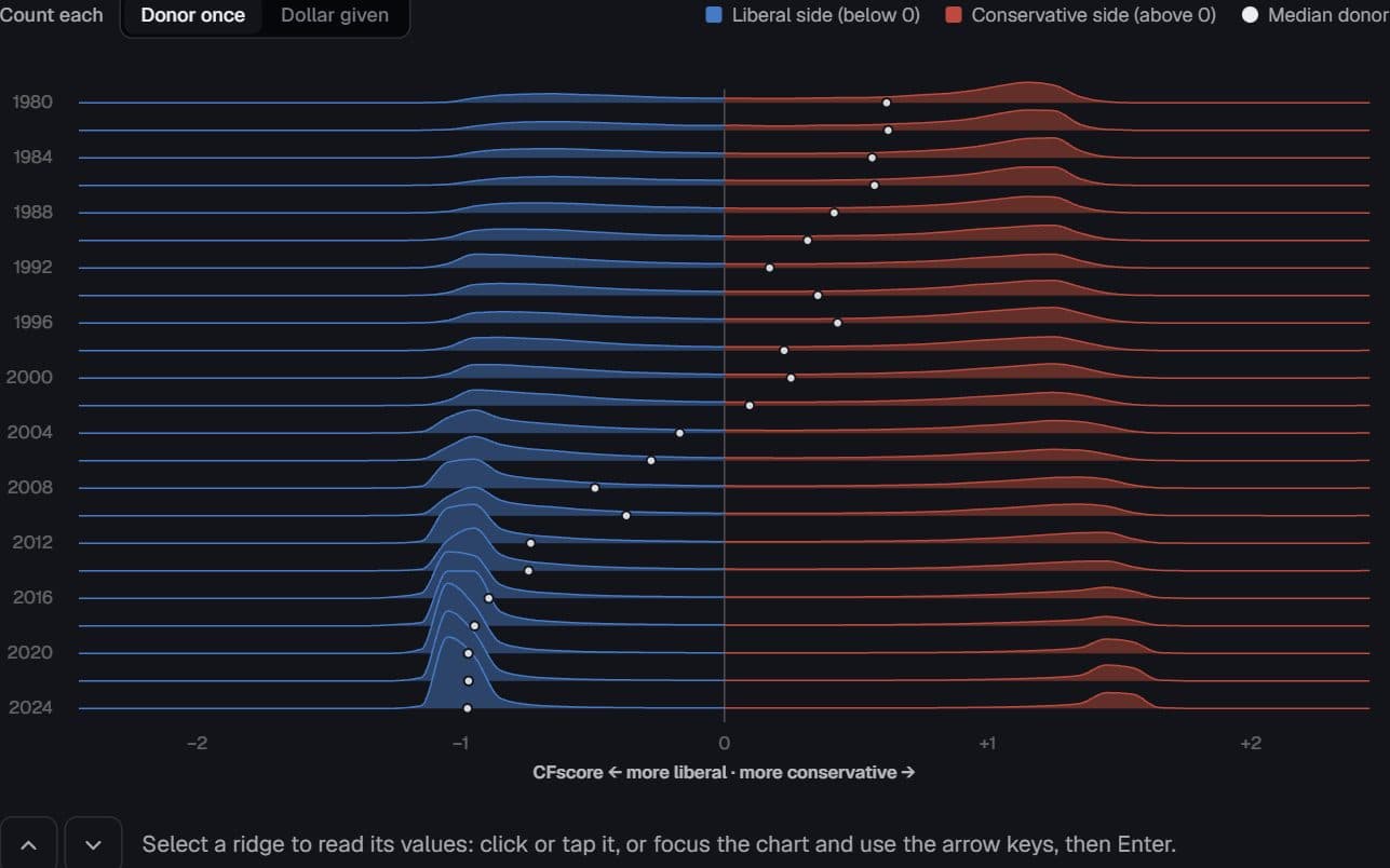
US federal donors · Stanford DIME, 1980–2024
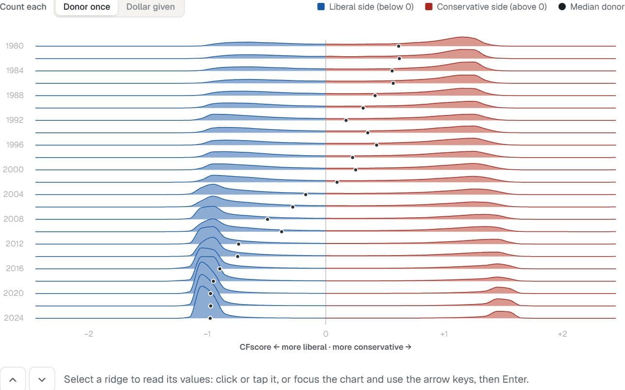
The donor centre emptied first
Where do reliable campaign donors sit on the left–right scale in each election cycle, and did the middle empty out?
Hides: Donors changing their minds. Each donor’s score is fixed; the ridges show who was giving each cycle.
Try it: Switch donor weighting
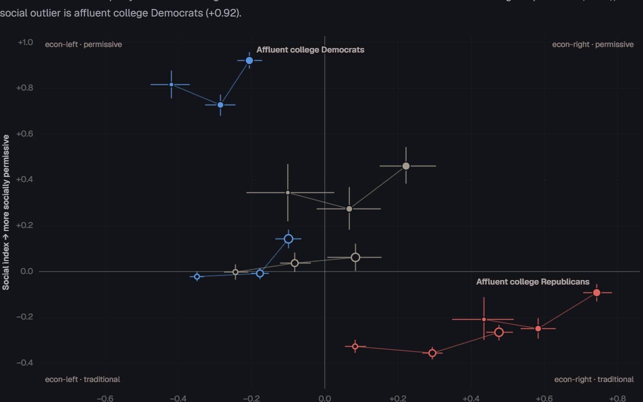
US voters · General Social Survey and ANES, 1948–2024
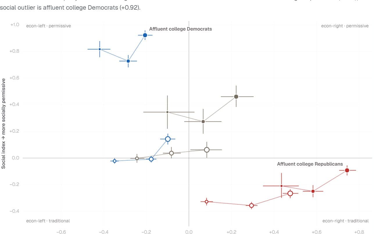
The outlier depends on the axis
Which slice of the electorate stands furthest from everyone else — and does the answer change between economic and social questions?
Hides: Design-based uncertainty. The intervals are bootstrap estimates, and the GSS moved online in 2021.
Try it: Switch survey items
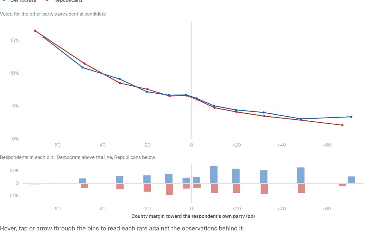
US voters · Cooperative Election Study, 2008–2024
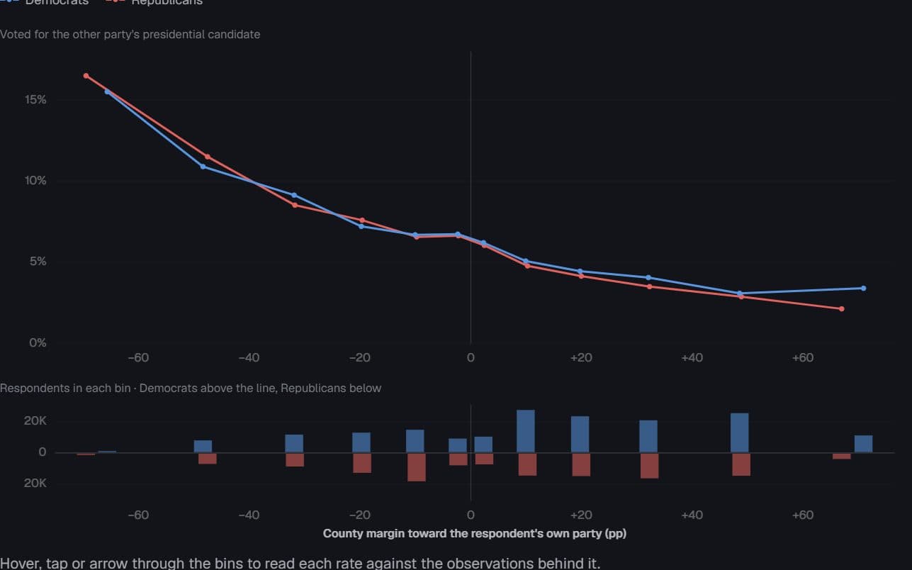
Outnumbered, and defecting
How much more often do partisans vote for the other party when their county leans against them — and how many people live where that effect is steepest?
Hides: The thin ends. The most extreme rates come from the smallest groups of respondents.
Try it: Switch the axis
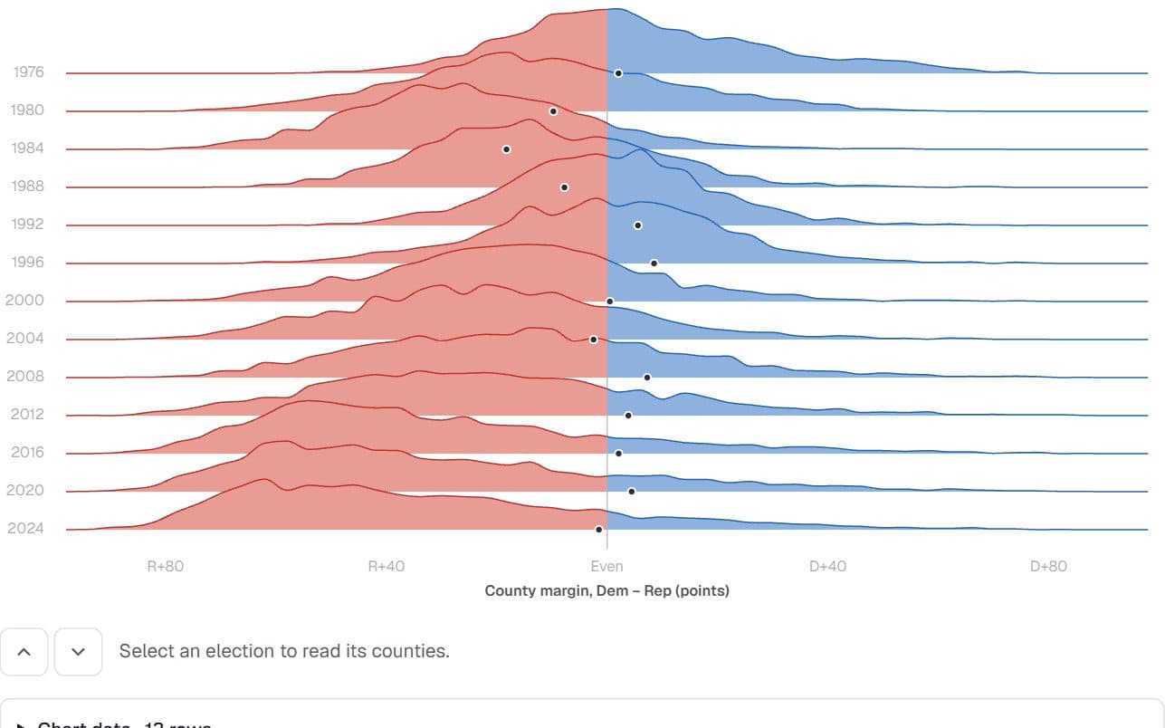
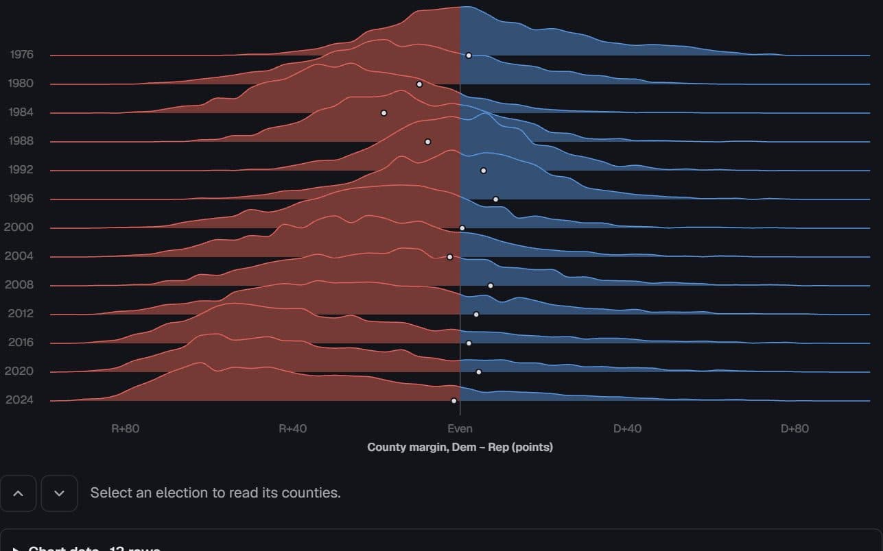
US counties · presidential returns, 1976–2024
Counties sorted into landslides
Between 1976 and 2024, did counties drift apart gradually or sort into landslides — and how far did the county map part from the national vote?
Hides: Population. Every county counts once, so the ridges describe the map rather than the vote.
Try it: Thirteen elections
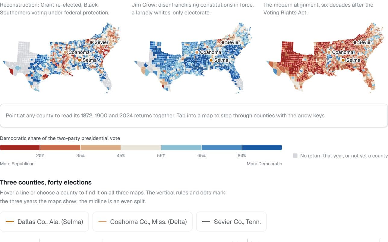
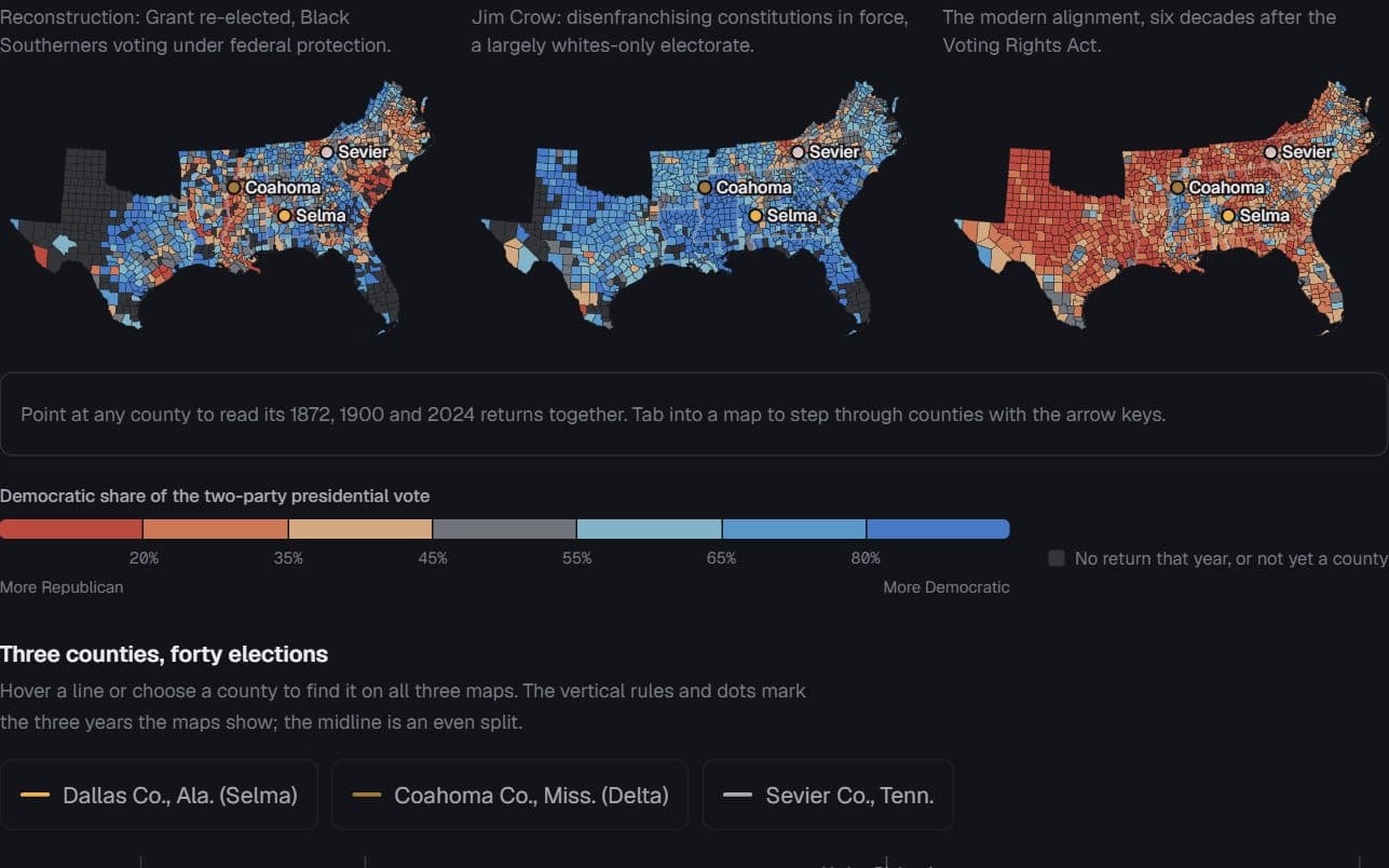
Eleven former Confederate states · county presidential returns, 1872, 1900, 2024
The map remembers, upside down
Does the South’s 1872 county map still predict how its counties vote?
Hides: Who could vote. Jim Crow–era Democratic shares describe a largely whites-only electorate.
Try it: Point at a county
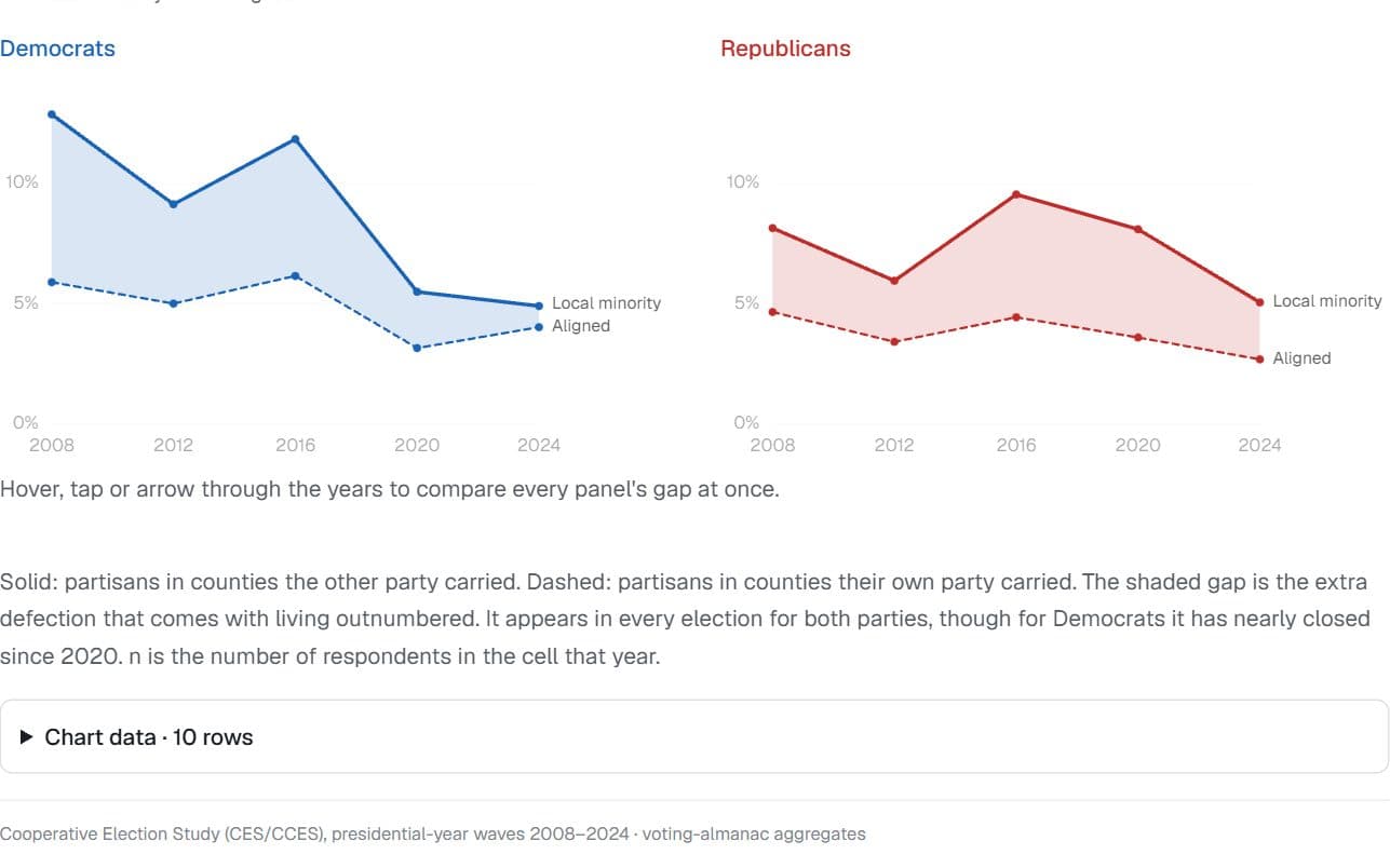
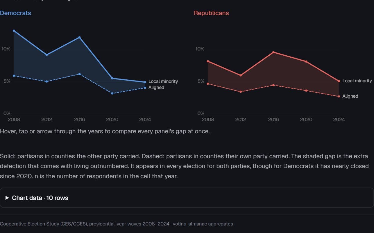
US voters · Cooperative Election Study, presidential years 2008–2024
The cost of living outnumbered
Does the extra defection among a party’s local minority hold up election after election?
Hides: Cause. Who moves where, and why, feeds the gap too.
Try it: Hover to read each election
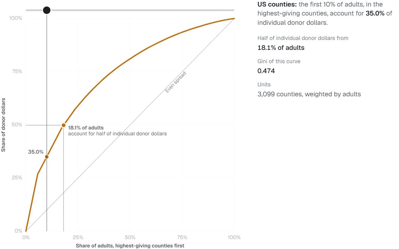
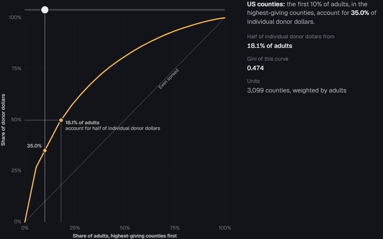
3,099 US counties · Stanford DIME donations and adult population
A sliver of the country funds the rest
What share of American adults supply half of all individual campaign donations?
Hides: Individual donors. Counties are the unit, so a curve over people would be steeper still.
Try it: Drag along the curve
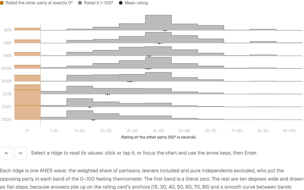
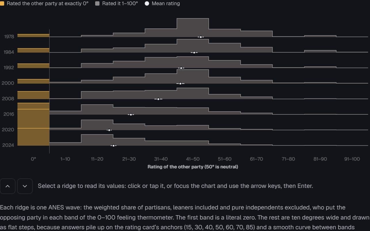
US partisans · American National Election Studies, 1978–2024
The cold mass at zero
How warmly do partisans feel about the other party, and how many now give it a literal zero?
Hides: How much is survey mode. Recent waves were mostly online, and online answers give more zeros.
Try it: Eight survey waves
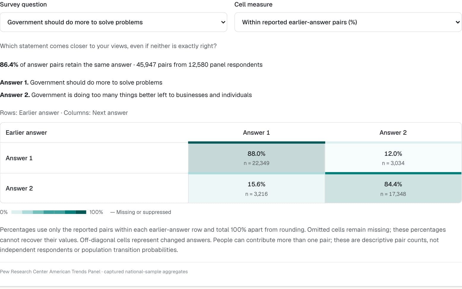
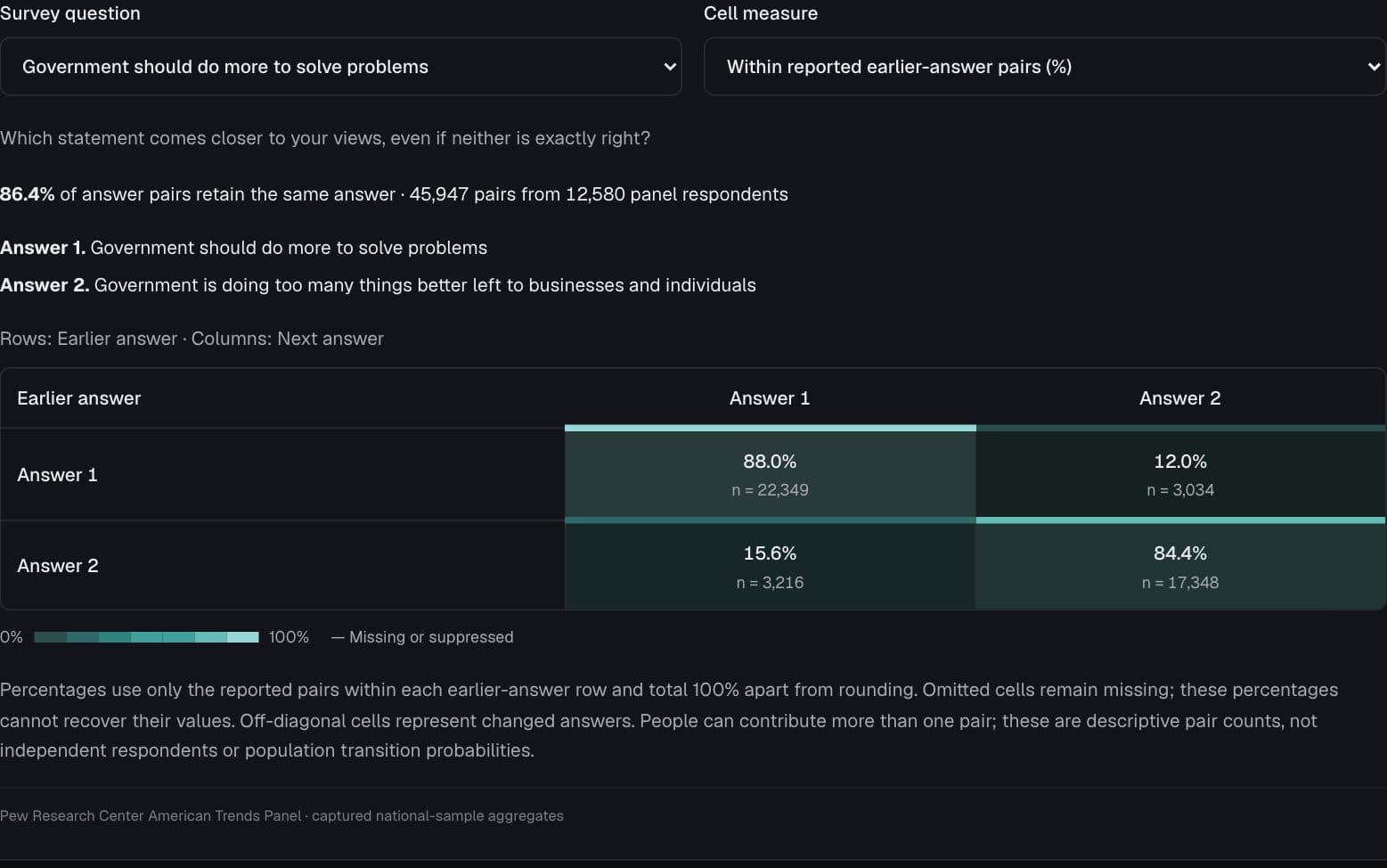
Pew Research Center American Trends Panel
When people change their minds
Which answers persist, and which answers do people move toward at their next interview?
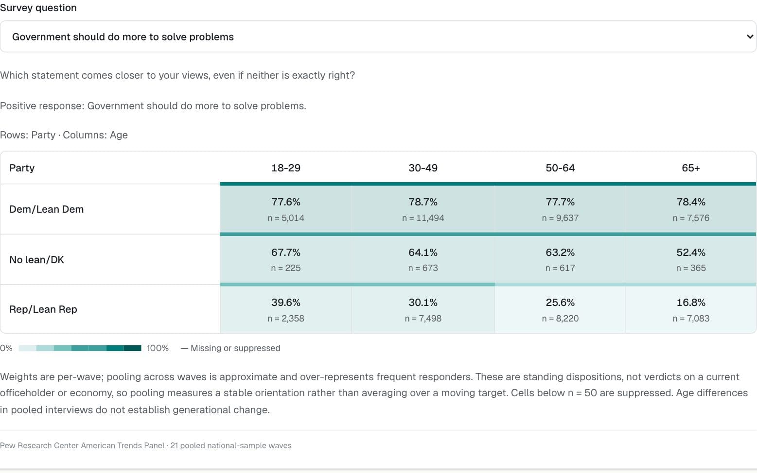
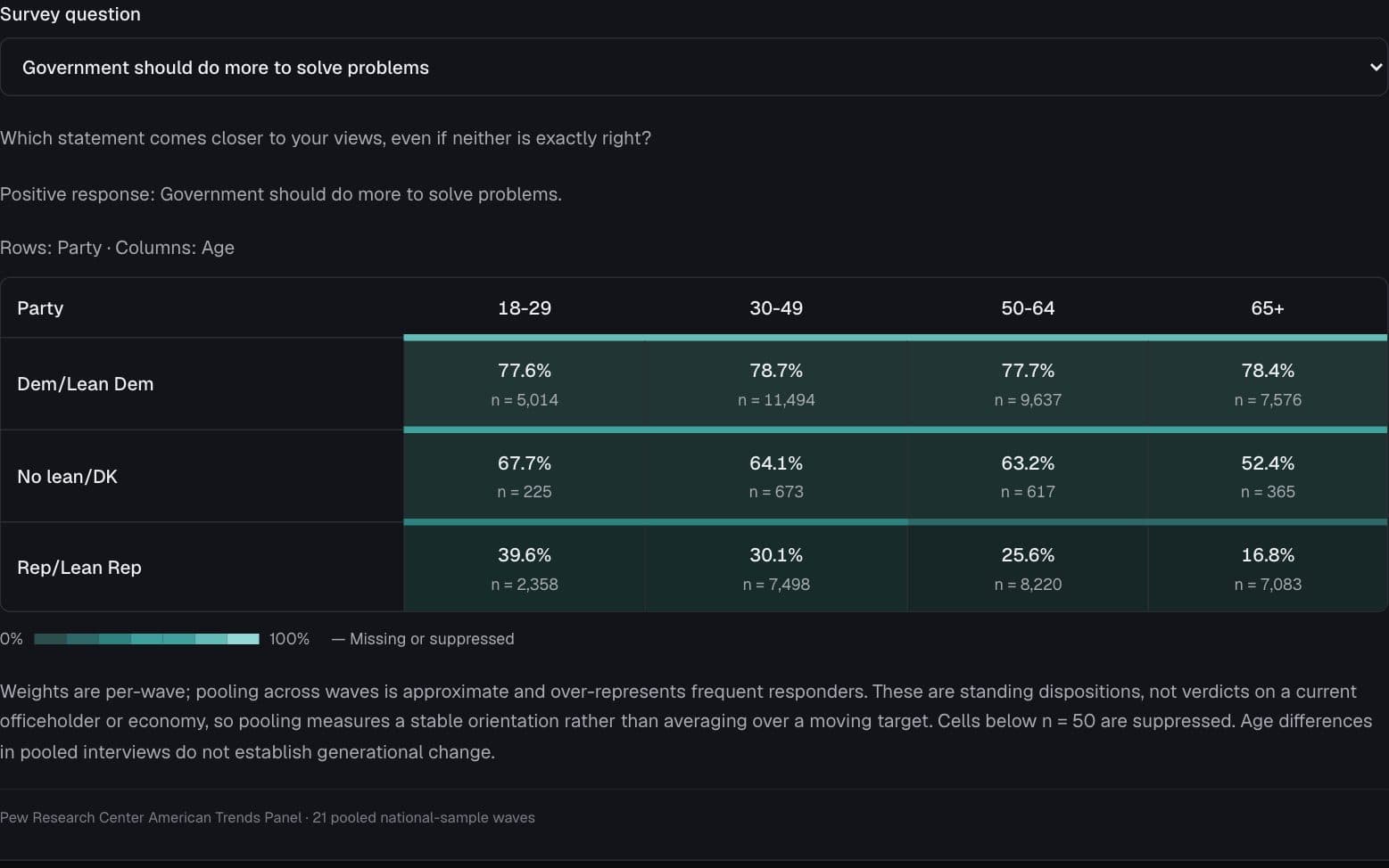
Pew Research Center American Trends Panel
Age divides, within party lines
Do age differences look the same among Democrats and Republicans?
Pew Research Center American Trends Panel
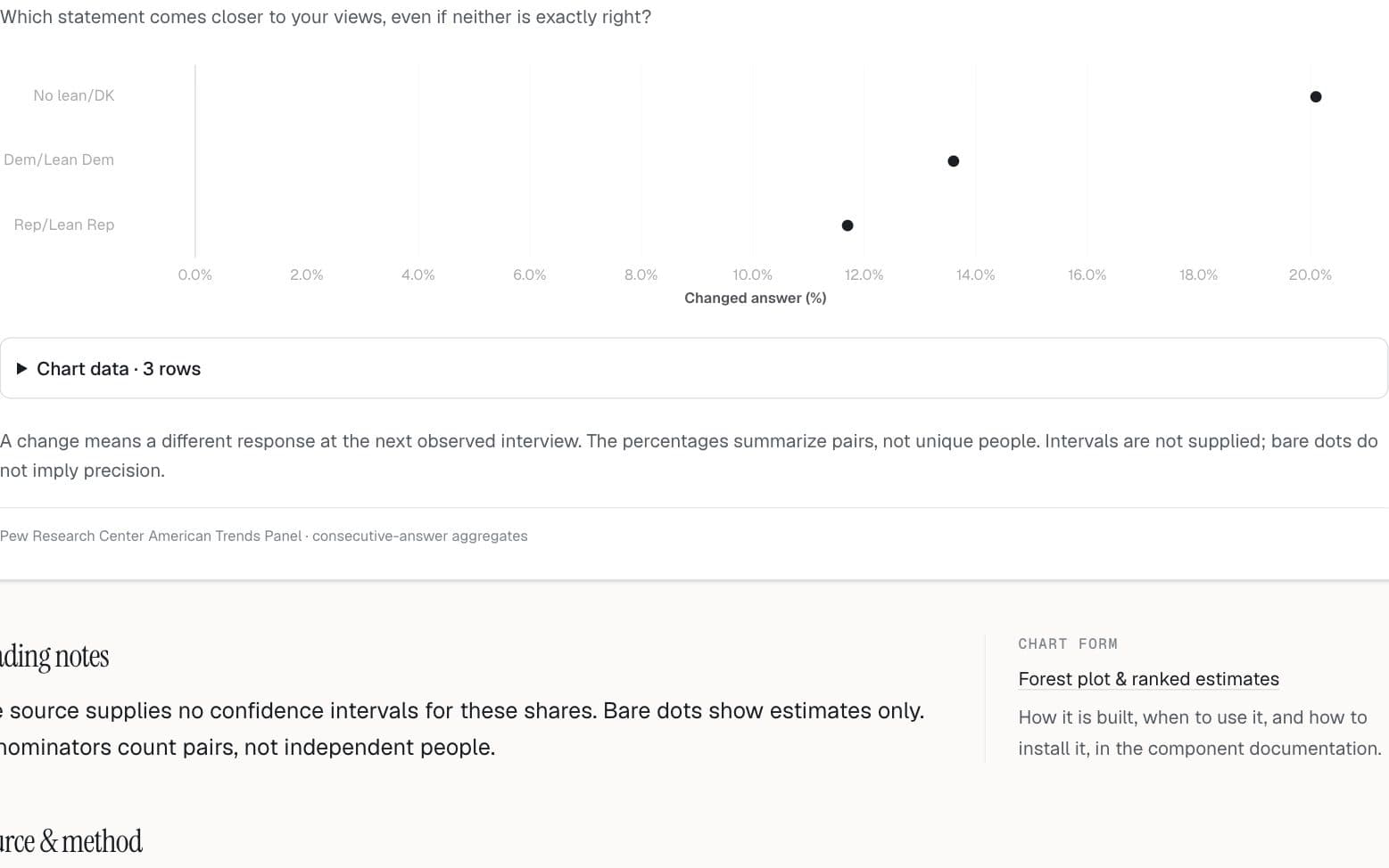
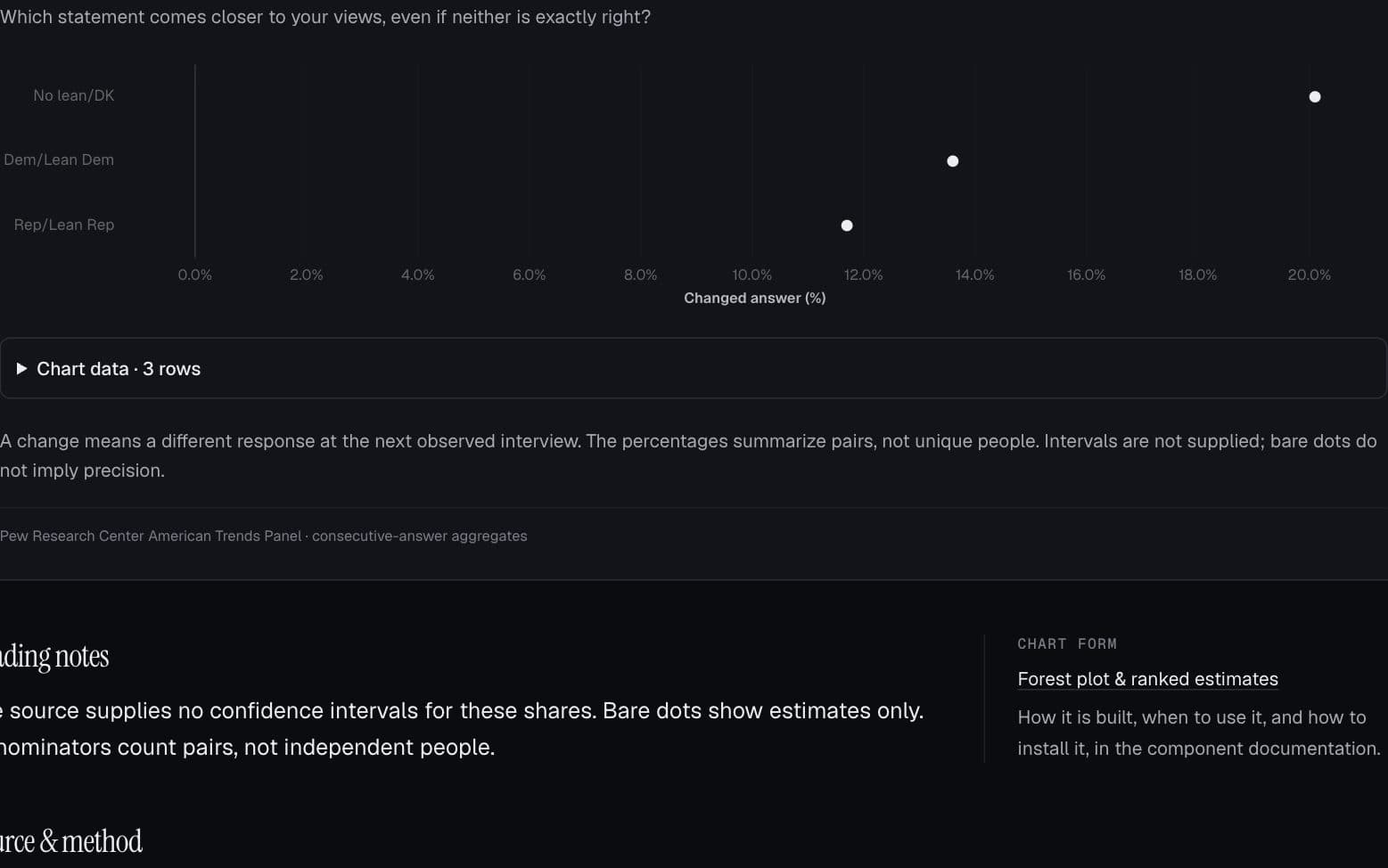
Who gives a different answer next time?
How does the frequency of changed answers vary across demographic groups?
General Social Survey
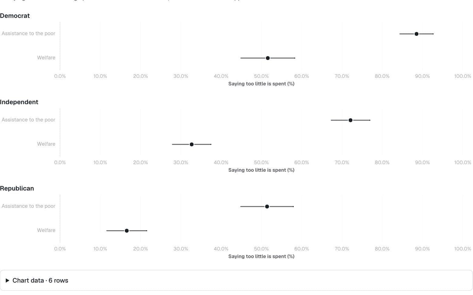
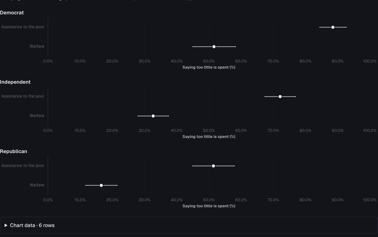
“Welfare” or “assistance to the poor”?
How different are spending priorities when the survey uses a different label?
General Social Survey
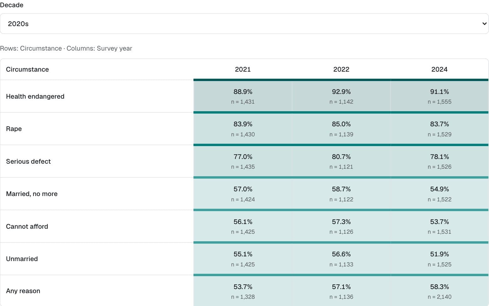
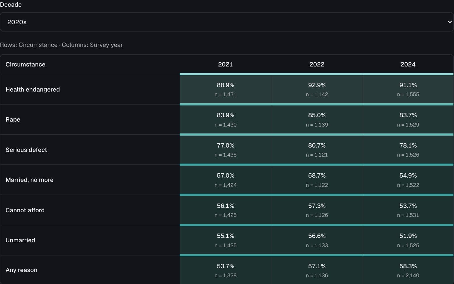
Seven circumstances, different answers
How does support for legal abortion depend on the circumstance and survey year?
Political history almanac
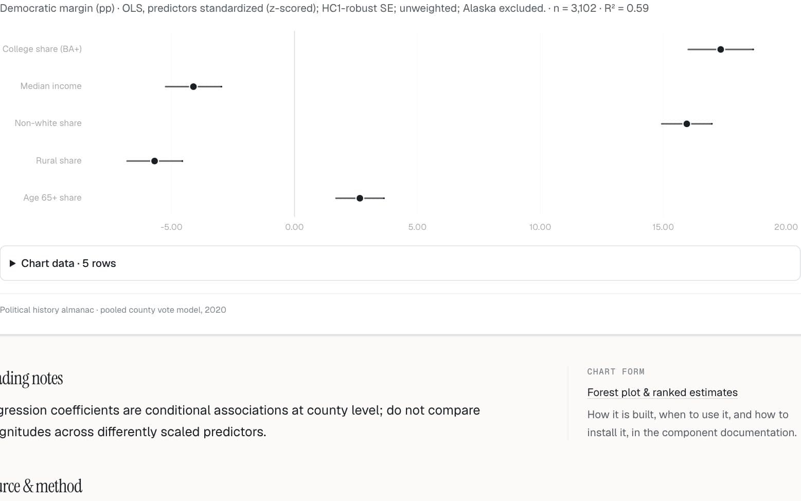
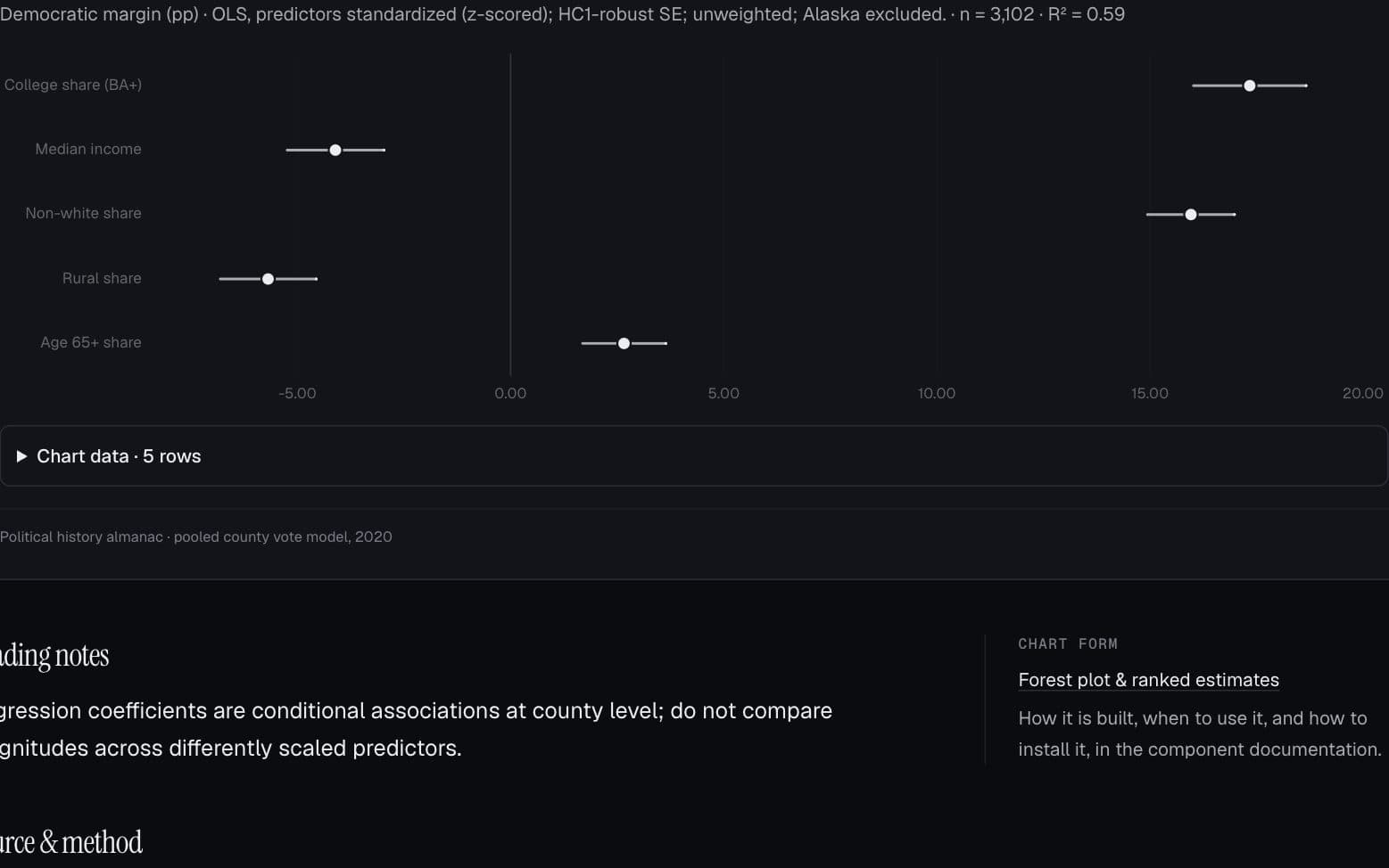
The predictors behind the vote
Which county characteristics are associated with the 2020 presidential vote?
Longer pages on politics & public opinion
Several figures together, with the components that draw them. These open in the component documentation.